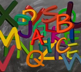
Designing a pop up banner is not as easy as it looks; a lot of things need to be considered for the banner to be as effective as possible. Colour is important, as is graphic layout. What is often underestimated, however, is the kind of fonts you use to convey your message – and how that message comes across when it is printed.
There’s more to a font than simple design. It’s about expressing a certain emotion and about being clear. Understanding what impression the font makes on a person is important for any kind of printed communication, but it’s especially important in advertising. Here’s a look at the fonts you should use – and avoid – for your pop up stands and pull up banners.
Why bother with fonts?
Fonts are more than just simple graphical representations of letters – the font you choose will create an impression, and you want that impression to be the right one. Your fonts are not there to make your roller banner look cute (unless that’s the specific goal). The fonts are there to make sure your message is loud and clear.
What to avoid
There are plenty of fonts to avoid, but here are just some examples:
- Comic sans – It used to be a favourite of many when it was just made public, but it’s really not appropriate if you want to make a professional impression.
- Impact – It was, as the name suggests, designed for impact. However, that was in 1965, and times have changed. From a distance, it can be hard to read and letters are difficult to distinguish.
- Segoe script – There are two problems with this font. First of all, it’s quite hard to read from a distance. Secondly, it’s hard to find other fonts that are compatible with it.
Great suggestions
When in doubt, you can’t go wrong with the following:
- Helvetica – It’s most commonly used, and people are very familiar with it.
- Century gothic – It’s neat, it’s easy to read, and it has a certain sense of style. It’s great for headlines.
- Verdana – It’s another member of the sans serif family, and was designed especially with legibility in mind.
Here’s one more thing you should understand about using fonts on your pop up stand and banner: don’t use more than two, maximum three. Switching fonts is a good way to attract attention and make the reader pay attention, but if you do it too often (especially when it’s a short message, such as on a pull up banner), it looks sloppy and disorganised. Choose clarity, and choose the font that makes your message clear. It’s the best way to ensure your banner has optimum effect.